Chart Types Primer
- Pie Chart
- Half Pie Chart
- Ring Chart
- Half Ring Chart
- Bar Chart
- Butterfly Chart
- Histogram Chart
- Stacked Chart
- Scatter Chart
- Line Chart
- Bubble Chart
- Packed Bubble Chart
- Bubble Pie Chart
- Geo Map Charts
- Heat Map Chart
- Combination Chart
- Area Chart
- Funnel Chart
- Web Chart
You can create various types of charts such as Area, Bar, Bubble, Line, Pie, Stacked, Scatter, Funnel, Web and 3D charts by simply dragging and dropping the required columns into the respective shelves in the design area.
Before we proceed any further into understanding the chart types and the combination of columns that can be used to create them, it is necessary that we first know about the functions associated with each column.
Listed below are the associated functions used in Zoho Analytics:
- Dimension: a column that has discrete values (eg. String and date column).
- Aggregate: a column with an aggregate function applied contains aggregate values like sum, average etc. This even includes aggregate formula columns.
- Measure: Measure column is nothing but a column containing numerical values that can be measured.
The chart designer looks as shown below. You can create charts by dragging and dropping the columns in their respected shelves. To know much more in detail about creating charts, you can refer to this help documentation.
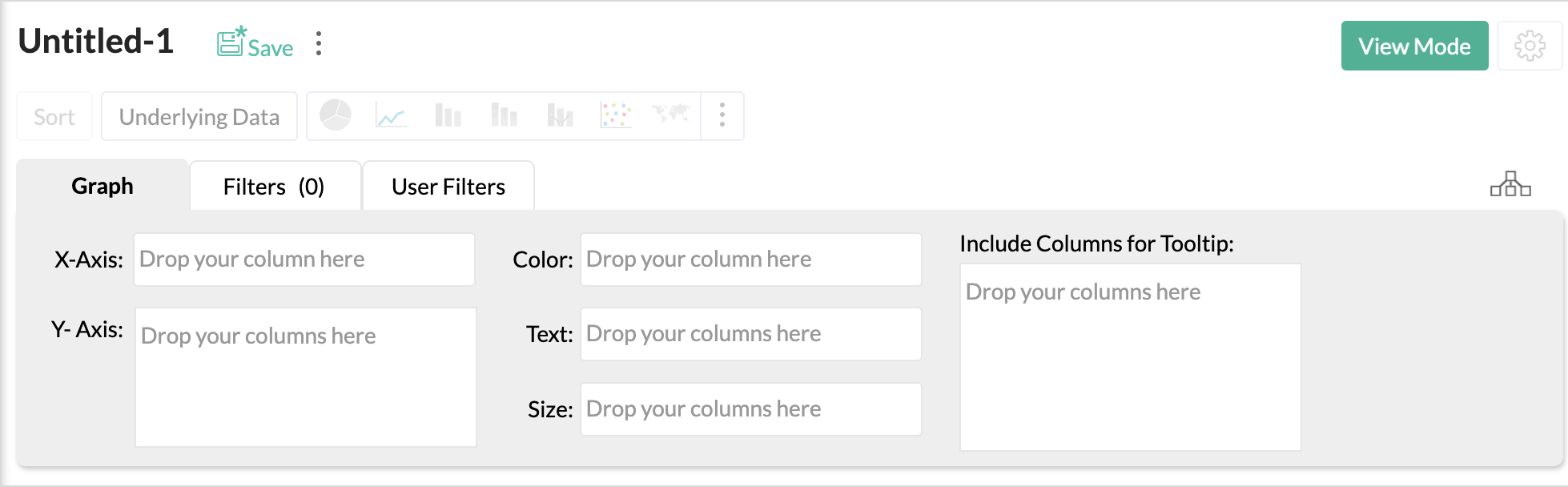
The chart types that are not applicable for the combination of columns that you use while creating the chart wil be disabled. Let us now see in detail about each chart type and the combination of column types used to create them.
Pie Chart
Pie charts are used to represent a percentage or proportional data. A pie chart can be converted to any of its equivalents like ring chart, funnel chart, bar chart, line chart, scatter chart, area chart or web chart.
The following combination of column types allows you to create a pie chart.
| X axis | Y axis | Color | Text | Tooltip | |
| Case 1 | Dimension | Aggregate | -- | Aggregate/ Measure/ Optional | Aggregate/ Measure/ Optional |
| Case 2 | Dimension/ Aggregate | Optional | -- | Aggregate/ Measure/ Optional | Aggregate/ Measure/ Optional |
| Case 3 | Optional | Aggregate/ Dimension | -- | Aggregate/ Measure/ Optional | Aggregate/ Measure/ Optional |
Example: Region wise Profit.
Half Pie Chart
The Half Pie Chart is similar to the pie chart but has a semi-circular shape. This chart is used to represent a percentage or proportional data. It can be converted to any of its equivalents like pie chart, ring chart, funnel chart, bar chart, line chart, scatter chart, area chart or web chart.
The following combination of column types allows you to create a half pie chart.
| X axis | Y axis | Color | Text | Tooltip | |
| Case 1 | Dimension | Aggregate | -- | Aggregate/ Measure/ Optional | Aggregate/ Measure/ Optional |
| Case 2 | Dimension/ Aggregate | Optional | -- | Aggregate/ Measure/ Optional | Aggregate/ Measure/ Optional |
| Case 3 | Optional | Aggregate/ Dimension | -- | Aggregate/ Measure/ Optional | Aggregate/ Measure/ Optional |
Example: Region wise Sales.
Ring Chart
Ring chart or otherwise called as a doughnut chart is used to represent data in rings. A ring chart displays the contribution of each value to the overall total expressed in percentage. Ring chart can be converted to any of its equivalents like pie chart, funnel chart, bar chart, line chart, scatter chart, area chart or web chart.
The following combination of column types allows you to create a ring chart.
| X axis | Y axis | Color | Text | Tooltip | |
| Case 1 | Dimension | Aggregate | -- | Aggregate/ Measure/ Optional | Aggregate/ Measure/ Optional |
| Case 2 | Dimension/ Aggregate | Optional | -- | Aggregate/ Measure/ Optional | Aggregate/ Measure/ Optional |
| Case 3 | Optional | Aggregate/ Dimension | -- | Aggregate/ Measure/ Optional | Aggregate/ Measure/ Optional |
Example: Region-wise sales%
Half Ring Chart
Half Ring chart is used to represent data in half rings. This displays the contribution of each value to the overall total expressed in percentage. Half ring chart can be converted to any of its equivalents like pie chart, half pie chart, ring chart, funnel chart, bar chart, line chart, scatter chart, area chart or web chart.
The following combination of column types allows you to create a half ring chart.
| X axis | Y axis | Color | Text | Tooltip | |
| Case 1 | Dimension | Aggregate | -- | Aggregate/ Measure/ Optional | Aggregate/ Measure/ Optional |
| Case 2 | Dimension/ Aggregate | Optional | -- | Aggregate/ Measure/ Optional | Aggregate/ Measure/ Optional |
| Case 3 | Optional | Aggregate/ Dimension | -- | Aggregate/ Measure/ Optional | Aggregate/ Measure/ Optional |
Example: Sales on Businessdays
Bar Chart
Bar charts are used when you have to compare data classified into discrete groups. They are generally used to categorize data or represent two or more metrics of a particular category. They display values as individual bars whose height is determined by the value plotted and grouped by each category. A Bar chart can be converted into any of its equivalents like Line, Scatter, Area, Stacked Bar, Stacked Area or Combo chart depending on the category.
The following combination of column types allows you to create a bar chart.
| X axis | Y axis | Color | Text | Tooltip | |
| Case 1 | Dimension | Aggregate | Dimension/ Aggregate/ Measure/ Optional | Aggregate/ Measure/ Optional | Aggregate/ Measure/ Optional |
| Case 2 | Dimension | Multiple Aggregate fields | Dimension/ Aggregate/ Measure/ Optional | Aggregate/ Measure/ Optional | Aggregate/ Measure/ Optional |
| Case 3 | Dimension/ Aggregate | Optional | Aggregate/ Measure/ Optional | Aggregate/ Measure/ Optional | Aggregate/ Measure/ Optional |
| Case 4 | Optional | Dimension/ Aggregate | Aggregate/ Measure/ Optional | Aggregate/ Measure/ Optional | Aggregate/ Measure/ Optional |
Example: Product Category wise sales
Learn more about Bar Charts and how to create them.
Butterfly Chart
A butterfly chart (also referred as Tornado chart or Divergent chart) is a type of bar chart used to compare two data sets at a time. This chart plots the data as two horizontal bars with the same X-axis in the center, resembling the butterfly wings.
This will be useful in comparing two data sets contrasting each other such as male vs female, income vs expense, positive vs negative, completed on time vs overdue, etc.,
The following combinations of column types are possible when creating butterfly charts.
| X-axis | Y-axis | Color | Text | Tooltip | |
| Case 1 | Dimension | Aggregate | Dimension | Aggregate/Optional | Aggregate/Optional |
| Case 2 | Dimension | Multiple Aggregate | - | Aggregate/Optional | Aggregate/Optional |
Learn more about Butterfly Charts and how to create them.
Histogram Chart
Histogram Chart is a special form of bar chart where the values are plotted over continuous rather than discrete categories and useful to plot frequency distributions.
The following combinations of column types are possible when creating Histogram charts.
| X axis | Y axis | Color | Text | Tooltip | |
Case 1 | Dimension | Aggregate/ | - | - | - |
Case 2 | Optional | Aggregate | - | - | - |
Case 3 | Aggregate/ | Dimension | - | - | - |
Case 4 | Aggregate | Optional | - | - | - |
Learn more about Histogram Charts and how to create them.
Stacked Chart
A Stacked chart allows you to easily analyze the patterns and trends in your data by comparing the parts of your dataset to the whole. In other words, it plots the contribution of each value to the total across categories. There are two types of stacked charts - Stacked Bar and Stacked Area.
Stacked Bar Chart
The following combination of column types allows you to create a stacked bar chart.
| X axis | Y axis | Color | Text | Tooltip | |
| Case 1 | Dimension | Aggregate | Dimension/ Aggregate/Measure | Dimension/ Aggregate/ Optional | Dimension/ Aggregate/ Optional |
| Case 2 | Optional | Dimension/ Aggregate | Dimension/ Aggregate/ Measure | Dimension/ Aggregate/ Optional | Dimension/ Aggregate/ Optional |
| Case 3 | Dimension/ Aggregate | Optional | Dimension/ Aggregate/ Measure | Dimension/ Aggregate/ Optional | Dimension/ Aggregate/ Optional |
Example: Quarter wise sales for each region.
Learn more about Stacked Bar Charts and how to create them.
Stacked Area Chart
YThe following combination of column types allows you to create a stacked area chart.
| X axis | Y axis | Color | Text | Tooltip | |
| Case 1 | Dimension | Aggregate | Dimension/ Aggregate/ Measure | Aggregate/ Optional | -- |
| Case 2 | Dimension | Multiple Aggregate fields | -- | Aggregate/ Optional | -- |
Example: Yearly profit obtained for each product category
Scatter Chart
Scatter charts are commonly used for plotting and comparing numeric values, such as scientific, statistical, and engineering data. It is generally used for comparison between two numerical axes with uneven intervals and ranges. You can interchange a scatter chart with a line chart.
The following combination of column types allows you to create a scatter chart.
| X axis | Y axis | Color | Text | Tooltip | |
| Case 1 | Dimension | Aggregate/ Dimension | Aggregate/ Dimension/ Measure/ Optional | Aggregate/ Dimension/ Measure/ Optional | Aggregate/ Dimension/ Measure/ Optional |
| Case 2 | Aggregate | Aggregate/ Dimension | Aggregate/ Dimension/ Measure/ Optional | Aggregate/ Dimension/ Measure/ Optional | Aggregate/ Dimension/ Measure/ Optional |
| Case 3 | Dimension/ Aggregate | Optional | Aggregate/ Dimension/ Measure/ Optional | Aggregate/ Dimension/ Measure/ Optional | Aggregate/ Dimension/ Measure/ Optional |
| Case 4 | Aggregate/ Dimension | Optional | Aggregate/ Dimension/ Measure/ Optional | Aggregate/ Dimension/ Measure/ Optional | Aggregate/ Dimension/ Measure/ Optional |
Example: Temperature Vs Rainfall
Line Chart
A line chart is used to analyze series trend across a time period. You can interchange a line chart with a scatter chart.
The following combination of column types allows you to create a line chart.
| X axis | Y axis | Color | Text | Tooltip | |
| Case 1 | Dimension | Aggregate/ Dimension/ Optional | Dimension/ Aggregate/ Measure/ Optional | Dimension/ Aggregate/ Measure/ Optional | Dimension/ Aggregate/ Measure/ Optional |
| Case 2 | Optional | Aggregate/ Dimension | Dimension/ Aggregate/ Measure/ Optional | Dimension/ Aggregate/ Measure/ Optional | Dimension/ Aggregate/ Measure/ Optional |
| Case 3 | Aggregate/ Dimension | Optional | Dimension/ Aggregate/ Measure/ Optional | Dimension/ Aggregate/ Measure/ Optional | Dimension/ Aggregate/ Measure/ Optional |
Example: Sales vs Cost vs Profit.
Bubble Chart
Bubble charts are really useful if you want to visualize your data highlighting the magnitude/weight of a data point with sizing. You can use a bubble chart wherever a Scatter plot is used, with scatters points being replaced by bubbles. The size of the bubble will be determined by the data column dropped in the new Size shelf of the Chart designer.
The following combination of column types allows you to create a bubble chart.
| X axis | Y axis | Color | Text | Size | Tooltip | |
| Case 1 | Dimension | Aggregate/ Dimension | Aggregate/ Dimension/ Measure/ Optional | Aggregate/ Dimension/ Measure/ Optional | Aggregate | Aggregate/ Dimension/ Measure/ Optional |
| Case 2 | Aggregate | Aggregate/ Dimension | Aggregate/ Dimension/ Measure/ Optional | Aggregate/ Dimension/ Measure/ Optional | Aggregate | Aggregate/ Dimension/ Measure/ Optional |
| Case 3 | Dimension | Optional | Aggregate | Aggregate/ Dimension/ Measure/ Optional | Aggregate | Aggregate/ Dimension/ Measure/ Optional |
| Case 4 | Aggregate | Optional | Dimension | Aggregate/ Dimension/ Measure/ Optional | Aggregate | Aggregate/ Dimension/ Measure/ Optional |
| Case 5 | Optional | Dimension | Aggregate | Aggregate/ Dimension/ Measure/ Optional | Aggregate | Aggregate/ Dimension/ Measure/ Optional |
| Case 6 | Optional | Aggregate | Dimension | Aggregate/ Dimension/ Measure/ Optional | Aggregate | Aggregate/ Dimension/ Measure/ Optional |
Example: Sales of each State by Product Category
Packed Bubble Chart
The Packed Bubble chart type is used to display data in a cluster of circles or bubbles. They are used to display the values disregarding the axes. The difference between a normal bubble chart and a packed bubble is that the latter is tightly packed rather than spread over a grid. You can use a packed bubble chart to visualize large amount of data in a small space.
The following combination of column types allows you to create a packed bubble chart.
| X axis | Y axis | Color | Text | Size | Tooltip | |
| Case 1 | Dimension | Aggregate/ Dimension | Aggregate/ Dimension/ Measure/ Optional | Aggregate/ Dimension/ Measure/ Optional | Aggregate | Aggregate/ Dimension/ Measure/ Optional |
| Case 2 | Aggregate | Aggregate/ Dimension | Aggregate/ Dimension/ Measure/ Optional | Aggregate/ Dimension/ Measure/ Optional | Aggregate | Aggregate/ Dimension/ Measure/ Optional |
| Case 3 | Dimension | Optional | Aggregate | Aggregate/ Dimension/ Measure/ Optional | Aggregate | Aggregate/ Dimension/ Measure/ Optional |
| Case 4 | Aggregate | Optional | Dimension | Aggregate/ Dimension/ Measure/ Optional | Aggregate | Aggregate/ Dimension/ Measure/ Optional |
| Case 5 | Optional | Dimension | Aggregate | Aggregate/ Dimension/ Measure/ Optional | Aggregate | Aggregate/ Dimension/ Measure/ Optional |
| Case 6 | Optional | Aggregate | Dimension | Aggregate/ Dimension/ Measure/ Optional | Aggregate | Aggregate/ Dimension/ Measure/ Optional |
Example: Region-wise Sales metric for each Quarter
Bubble Pie Chart
Bubble Pie Chart is a combination of pie and bubble charts. The data column dropped in the Size shelf determines the size of the bubble. Other aggregation will be plotted as a proportional division of the bubble. It is a useful way to display data with multiple variables.
| X axis | Y axis | Size | Color | Text | Tooltip | |
| Case 1 | Dimension | Aggregate | Aggregate | Dimension | Aggregate/ Optional | Optional |
| Case 2 | Dimension | Multiple Aggregate fields | Aggregate | -- | Aggregate/ Optional | Optional |
Example: Sales by Card Type across State.
Geo Map Charts
A Geo Map chart is a map of a world, continent, country, state, or a city, with the data values assigned to specific regions through chart visualizations. These geo map charts are also called as geo visualizations. Geo map charts analyze geo spatial data through the use of interactive visualization.
Zoho Analytics offers many types of geo map charts.
Map Scatter Chart
Map Scatter chart is a scatter chart over a map. This is commonly used for plotting axes with uneven intervals and ranges.
The following combination of column types allows you to create a Map Scatter chart.
| X axis | Y axis | Color | Size | Text | Tooltip |
| Geo | Aggregate/ Dimension/ Measure/ Optional | Aggregate/ Dimension/ Measure/ Optional | - | Aggregate/ Dimension/ Measure/ Optional | Aggregate/ Dimension/ Measure/ Optional |
Example: Profit across State.
Map Bubble Chart
Map Bubble chart is a bubble chart over a map. The bubbles highlight the magnitude/weight of data point with sizing. You can use a bubble chart wherever a scatter chart is used, with scatter points being replaced by bubbles. The size of the bubble will be determined by the data column dropped in the Size shelf.
The following combination of column types allows you to create a Map Bubble chart.
| X axis | Y axis | Color | Size | Text | Tooltip |
| Geo | Aggregate/ Dimension/ Measure/ Optional | Aggregate/ Dimension/ Measure/ Optional | Aggregate | Aggregate/ Dimension/ Measure/ Optional | Aggregate/ Dimension/ Measure/ Optional |
Example: Profit across State.
Map Pie Chart
Map pie chart is a pie chart over a map. This is plotted as multiple pies across the region with each metrics as proportional division.
The following combination of column types allows you to create a Map Pie chart
| X axis | Y axis | Color | Size | Text | Tooltip | |
| Case 1 | Geo | Aggregate/ | Aggregate/ Dimension/ Measure | -- | Aggregate/ Dimension/ Measure/ Optional | Aggregate/ Dimension/ Measure/ Optional |
| Case 2 | Geo | Multiple Aggregate | -- | -- | Aggregate/ Optional | Aggregate/ Dimension/ Measure/ Optional |
Example: Payment Type wise Sales across State.
Map Bubble Pie Chart
Map Bubble Pie Chart is a combination of pie and bubble charts plotted on a map. The data column dropped in the Size shelf determines the size of the bubble. Other aggregation will be plotted as a proportional division of the bubble.
The following combination of column types allows you to create a Map Bubble Pie chart
| X axis | Y axis | Color | Size | Text | Tooltip | |
| Case 1 | Geo | Aggregate/ | Aggregate/ Dimension/ Measure | Aggregate | Aggregate/ Dimension/ Measure/ Optional | Aggregate/ Dimension/ Measure/ Optional |
| Case 2 | Geo | Multiple Aggregate | -- | Aggregate | Aggregate/ Optional | Aggregate/ Dimension/ Measure/ Optional |
Example: Payment Type wise Sales across State.
Map Filled Chart
Map Filled Chart plots the data across regions by filling a particular color for each region. This is used for emphasizing the change in metrics across regions.
The following combination of column types allows you to create a Map Filled Chart.
| X axis | Y axis | Color | Size | Text | Tooltip |
| Geo (Country/State/County) | Aggregate/ Dimension/ Measure/ Optional | Aggregate/ Dimension/ Measure/ Optional | -- | Aggregate/ Dimension/ Measure/ Optional | Aggregate/ Dimension/ Measure/ Optional |
Example: Sales across State.
Heat Map Chart
Heat map is a chart that displays data values as colors inside a matrix. This is a two-dimensional grid chart, where each color represents the data.
You can also choose to derive the size and color intensity of each cell based on the data. This will be pretty useful for categorizing and visualizing data based on factors like volume of occurence, intensity, performance scale (bad to good) etc.,
The following combination of column types allows you to create a Heat Map chart.
| X axis | Y axis | Color | Size | Text | Tooltip |
| Dimension | Dimension | Aggregate | Optional | Aggregate Optional | Aggregate Optional |
Example: Sales across a Year by Month and Week.
Combination Chart
The combination chart is a combination of two or more type of charts. You can combine bar, line, area, bubble and scattered in one chart. This will be useful when you have a mixed type of data to represent.
The following combination of column types allows you to create a combination chart.
| X axis | Y axis | Color | Text | Tooltip | |
| Case 1 | Dimension | Multiple Aggregate | -- | Optional | Optional |
| Case 2 | Dimension | Aggregate | Dimension | Optional | Optional |
Example: Profit, Sales and Cost across Years
You can choose the chart type from the Combination tab of the Chart Settings page.
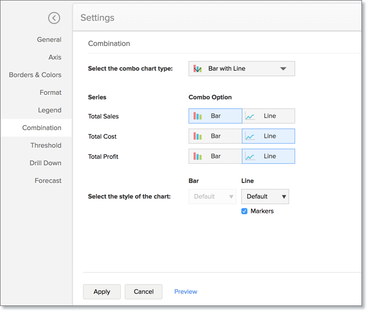
- Select the combo chart type. Available options are:
- Bar with Line
- Bar with Bubble
- Bar with Scattered
- Bar with Area
- Area with Bubble
- Line with Bubble
- Custom Combination (This allows selecting custom combination using any of the five chart types)
- In Series, select the chart type for each data series.
- Select the style of the chart. Select the style for the chart. The following are the available styles for each chart type:
- Bar - Bar and Stacked Bar
- Line - Line, Smooth Line and Step Line
- Area - Area and Stacked Area
- Bubble - Bubble and Bubble Pie
Area Chart
Area charts shade the area beneath the lines and therefore help you more readily to compare data magnitudes. They are mainly used for emphasizing the change in metrics across time. You can interchange an area chart with a web chart.
The following combination of column types allows you to create an area chart.
| X axis | Y axis | Color | Text | Tooltip | |
| Case 1 | Dimension | Aggregate | Dimension/ Aggregate/ Measure/ Optional | -- | -- |
| Case 2 | Dimension | Aggregate | Dimension/ Aggregate/ Measure/ Optional | Aggregate | Aggregate |
Example: Year wise Sales
Funnel Chart
The funnel chart is used to represent a progressive flow of a business metric across phases.
The following combination of column types allows you to create a funnel chart.
| X axis | Y axis | Color | Text | Tooltip | |
| Case 1 | Dimension | Aggregate | -- | Aggregate/ Measure/ Optional | Aggregate/ Measure/ Optional |
| Case 2 | Optional | Aggregate | -- | Aggregate/ Measure/ Optional | Aggregate/ Measure/ Optional |
Example: Sales Pipeline - To visualize potentials across each stage
Learn more about Funnel Charts and how to create them.
Web Chart
Web charts help in studying the comparison between different data series. It compares the values of a number of data series represented with data markers in proportion with a center point.
The following combination of column types allows you to create a web chart.
| X axis | Y axis | Color | Text | Tooltip | |
| Case 1 | Dimension | Aggregate | Dimension/ Optional | -- | Aggregate/ Measure/ Optional |
Example: Cost Vs Sales for 2016