Brand Assets
Logo
Our logo is our most valuable brand asset. Consistent usage of our logo is absolutely essential in establishing brand consistency. Our logo is simple, straightforward, and vibrant.
Do's

Perfectly proportionate logo

Logo in black background

Monochrome in light background

Monochrome in dark background
Don'ts

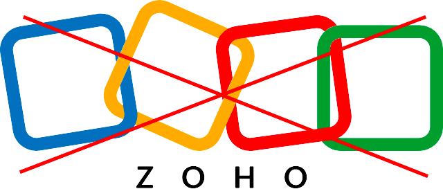
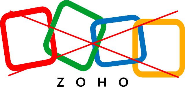
Do not alter the color sequence

Do not alter the shape

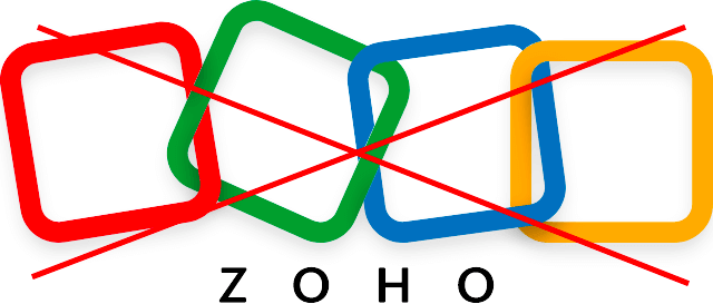
Do not add any effect or shadows to the logo

Do not alter the proportion
Colours
Primary colours
Secondary colours
Alerts
Typography
Zoho Puvi
Our typeface is functional, scalable, and dynamic. It is transmutable across different formats and environments. So you can see it sitting comfortably within a pop-up box alerting our users, inside our product or maxed-out on a billboard that scales an entire building, catching attention. Every pixel of the new font was perfected to make our users’ reading experience better.
1234567890!@#$%^&*()For queries related to logo contact pr@zohocorp.com