- HOME
- Best practices & Guides
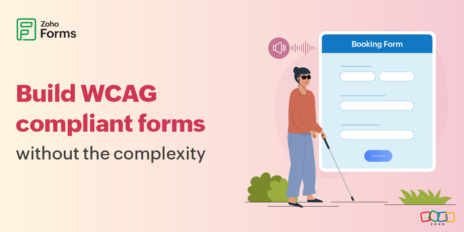
- How to create accessible forms (WCAG-Compliant)
How to create accessible forms (WCAG-Compliant)
- Last Updated : February 24, 2026
- 778 Views
- 8 Min Read
Do you know how many users are landing on your form, ready to sign up, register, or buy but instead they just leave.
They don't call your support line. They don't send feedback. They are just gone, and you have no idea why your conversion rate is lower than it should be.
There are many reasons why users may have difficulty using your site or completing a form. According to the World Health Organization, over 1.3 billion people globally experience significant disability. That's roughly 16% of the world's population.
If your forms are not designed for them, that makes it one in six people who might bounce off your forms before you even know they were there. In the US alone, 27% of adults, which is roughly one in four, have a disability. This is not just about permanent disabilities either. Break your arm, and suddenly you realize how much the internet assumes you have two functioning hands.
Most companies are sitting on digital accessibility debt they do not even know about.
Forms built 5, 7, even 10 years ago were often set up without attention to accessibility, but they are still out there attempting to collect leads, process orders, handle registrations. More than 96% of home pages have detectable WCAG failures. And every new form you build on the old patterns adds to this pile.
What are accessible forms?
Accessible forms are forms designed so everyone including people with disabilities can easily see, understand, navigate, and complete them. The idea is simple: no one should be blocked from submitting a form because of how it’s built. Most accessible forms follow WCAG (Web Content Accessibility Guidelines), ensuring inclusivity and often helping with legal and compliance requirements too.
Importance of creating accessible forms
When we talk about form accessibility, many organizations immediately think of legal compliance and avoiding lawsuits. And yes, accessibility lawsuits have absolutely exploded in recent years.
But when you fix forms for accessibility, everyone benefits.
E-commerce retailers in the US lose approximately $6.9 billion annually with more accessible websites. In the UK, £17.1 billion in annual revenue is lost because customers click away from inaccessible sites.
What WCAG means for accessible web forms
The Web Content Accessibility Guidelines (WCAG) may sound intimidating and, to be fair, it is a massive document full of technical jargon. But strip away the formal language, and it's actually pretty straightforward.
How to build WCAG-accessible forms
Screen readers: make the form speak clearly
A good form turns into a clear conversation:
- “What is this field?”
- “What’s required?”
- “What happens next?”
Well-built forms tell the screen reader everything it needs to know.
Keyboard navigation: access without a mouse
Keyboard navigation helps way more people than just those who cannot use a mouse. Power users love it for speed. People on laptops often prefer it.
Visual design: readable, not just beautiful
Low-contrast text is the most commonly detected accessibility issue, affecting 81% of homepages. The colors you choose might look refined on your brand guidelines but read as "I can't see this" to users with low vision.
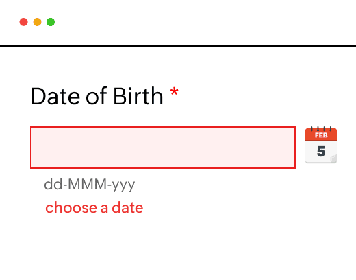
Some users need to zoom to 200% or more to read comfortably. Your form should still work, no horizontal scrolling, no content cut off, no broken layouts.
Error messages: guidance, not frustration
Error: Invalid input." Cool, thanks. But which field? What's wrong with it? How do I fix it?
Be specific about what's wrong. Explain how to fix it. If the phone number needs to be in a specific format, show an example: "(555) 555-5555".
Catch errors early when possible. If you can validate a field immediately after someone fills it out, do that. Don't wait until they have completed 30 fields and clicked submit to tell them field 3 was wrong.
Mobile accessibility: not optional anymore
Over half of web traffic is mobile now. Yet somehow, tons of forms still treat mobile as an afterthought. 72% of adults with disabilities own a smartphone, making mobile accessibility critical.
Tips to create accessible forms using WCAG principles
It boils down to four human needs.
Remember one word: POUR
Tip 1: Make your form perceivable for all users
It means people should be able to perceive your form. It sounds obvious, but many forms are essentially invisible to screen readers. Other common issues include placing critical information in an image with no text alternative, or using color combinations that might look "on brand" but are impossible to read for people with low vision.
Questions to ask to make sure your form is perceivable:
- Can someone using a screen reader tell what each field is for?
- If you are showing an error in red, is color the only way you are indicating it's an error?
- Can someone zoom in without everything breaking?
Tip 2: Ensure your form is operable with keyboard navigation
Can someone use your form without a mouse?
Every button, every dropdown, every checkbox needs to work with just a keyboard. And the path through the form needs to make sense, you should not be jumping all over the place randomly as you tab through fields.
Tip 3: Make your form understandable with clear labels and errors
This is where a lot of forms fail hard. They assume everyone has the same context they do. They don't explain what format they want.
“Invalid input.”
Invalid how?
Which field?
What’s the correct format?
Accessible forms:
- Use clear labels
- Explain expectations upfront with instructions
- Tell users exactly how to fix errors in the error messages

Tip 4: Build forms that work with assistive technologies
It means your form works with the actual assistive technology people use, not just what you think they might use. Screen readers, voice control software, alternative keyboards, all of it.
Steps to improve WCAG form accessibility
- Fix your most important forms first
Pick your top five forms that gets the most traffic or generates the most revenue. That is your starting point. - Turn on accessibility features
If your form builder supports accessibility features, turn them on. If it does not, start evaluating alternatives. - Track impact
Watch your completion rates and abandonment rates.
How to implement WCAG-accessible forms without complexity
How do you actually fix this?
You don't need to become an accessibility expert. You don't need to hire consultants. Many accessible form builders have made this straightforward.
Step 1: Build your form like you normally would.
Drag and drop fields, set up your logic, design it how you want. Configure to prefill forms whenever possible.
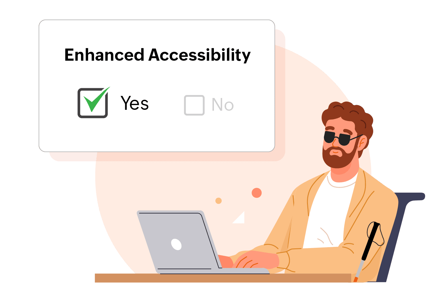
Step 2: Flip the accessibility switch.
Seriously, there is often just a toggle or checkbox. In Zoho Forms, you'll find the Enhanced Accessibility feature in Settings.
Your form now has screen reader support, keyboard navigation, proper error handling, all of it.
How Zoho Forms helps you meet WCAG standards (without making accessibility your full-time job)
Zoho Forms is built with accessibility in mind and aligns with WCAG 2.2 Level AA guidelines, helping organizations create forms that are usable by everyone.
Accessibility that is built in
Once you enable Enhanced Accessibility in Zoho Forms, the platform automatically applies behaviors behind the scenes that include logical navigation order and compatibility with assistive technologies, without you having to manually handle the technical complexity.
You build your form the way you normally would. Zoho Forms takes care of complying with the accessibility guidelines.
Screen reader compatibility
Zoho Forms works seamlessly with popular screen readers, allowing users with visual impairments to interact with forms confidently and independently.
Instead of forcing users to guess or navigate blindly, the form communicates clearly at every step to remove barriers and turn form filling into a guided experience.
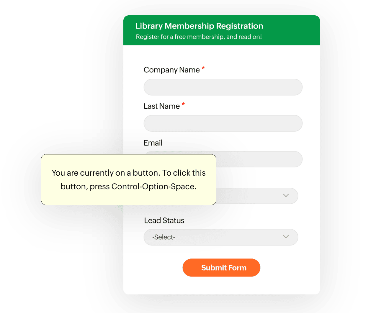
Logical focus order and keyboard navigation
Users can navigate Zoho Forms entirely using a keyboard.
The focus moves logically between fields, buttons, and controls, mirroring the visual flow of the form. This predictable navigation ensures users are not jumping randomly across the page, which is especially important for screen reader users and users with motor impairments. Every interactive element remains accessible without requiring a mouse.
Highlighted critical information
Zoho Forms automatically highlights critical information such as mandatory fields and error messages.
These visual cues make it easier for users with low vision or cognitive challenges to notice what needs attention. At the same time, these highlights are also communicated to assistive technologies to ensure no one misses essential information.
All messages are customizable, so you can adapt the tone and clarity to suit your audience.
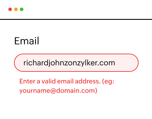
Error identification
Zoho Forms does not just tell users that something went wrong, it shows them exactly where and why. If a user tries to submit a form with missing or incorrect information, the problematic fields are clearly highlighted, drawing immediate attention to what needs fixing. Alongside this, Zoho Forms displays specific, easy-to-understand error messages that explain what’s wrong and how to correct it. These messages are fully customizable.
Underlined links
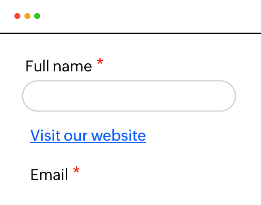
Underlined links make interactive elements instantly recognizable. By visually distinguishing links from surrounding text, underlining removes any ambiguity about what can be clicked or tapped. Users don’t have to rely on color alone to identify a link, which is especially important for people with low vision or color-blindness.
Zoom level
Zoho Forms supports zooming in up to 200%, allowing users to magnify text and form fields without sacrificing clarity or usability. As the content scales, the layout remains intact, text stays readable, fields remain accessible, and nothing gets cut off or overlaps awkwardly.
This ensures that users with low vision or those who simply need larger text can comfortably read and interact with the form, without horizontal scrolling or broken designs.
Responsive forms
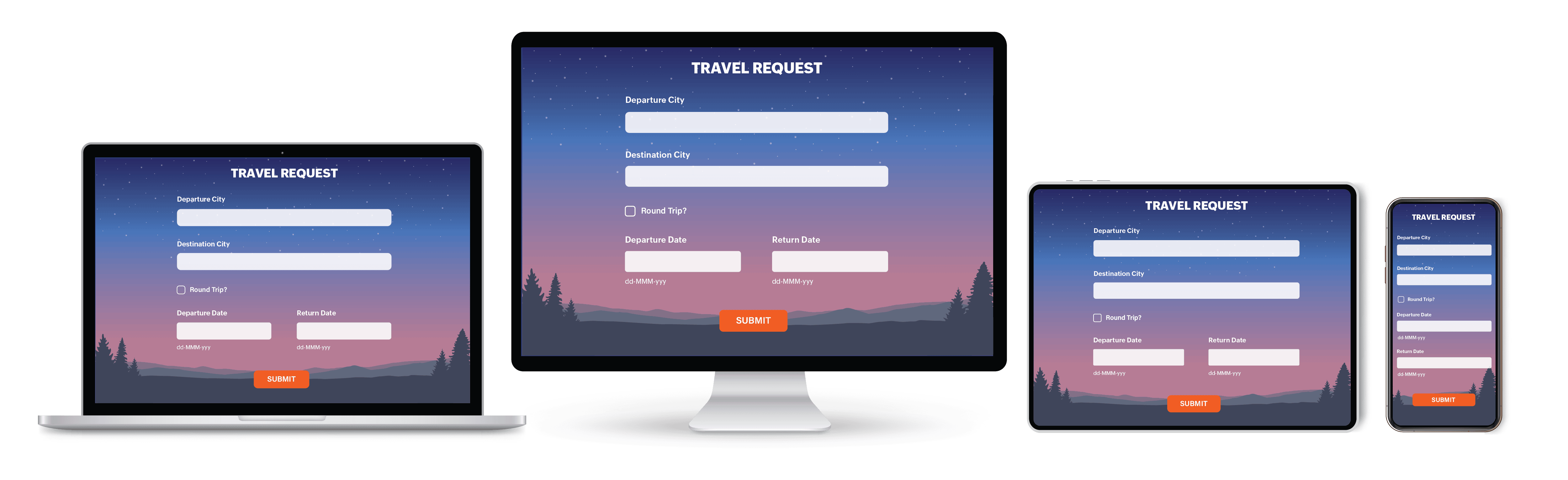
Zoho Forms are designed to adapt seamlessly to any screen size or browser. Whether users are filling out a form on a desktop, tablet, or smartphone, the layout automatically adjusts to fit the screen without compromising readability or usability.
By eliminating the need for pinching, zooming, or horizontal scrolling, responsive forms make interactions smoother and more accessible for everyone.
Every form you publish sends a message
It either says, “This is easy. You belong here.”
Or it says, “This wasn’t built for you.”
When someone leaves your form without a trace, it is easy to assume they were not interested. But often, they were. They just hit a barrier you could not see.
Accessible forms don’t just check a compliance box. They open doors and welcome more people in.
With tools like Zoho Forms, accessibility does not have to be complicated, expensive, or time-consuming. The foundation is already there, you just have to turn it on and build with intention.
Zoho Forms’ ongoing commitment to WCAG accessibility
Accessibility is an ongoing responsibility. And it is something the Zoho Forms team takes seriously.
Behind the scenes, the team is constantly exploring new ways to make Zoho Forms more inclusive and easier to use for everyone. This means sharing accessibility best practices internally, learning from real-world usage, and staying closely aligned with evolving accessibility standards.
Zoho Forms is regularly tested using screen readers and other assistive technologies, with manual checks to catch issues automated tools often miss. The team also stays up to date with the latest WCAG guidelines, ensuring improvements keep pace with how people actually use the web.
Think of the Zoho Forms team as your behind-the-scenes accessibility task force working continuously to remove barriers, so your forms can reach, include, and work for everyone.
 Samhita V
Samhita is a seasoned product expert at Zoho Forms who blends deep product expertise and user education to help businesses make sense of powerful features without the jargon. Known for her thoughtful storytelling and crisp communication, she adds a subtle creative flair to every piece she writes. With a knack for spotting real-world use cases and adding a touch of fun to her narratives, she’s on a mission to make even the most complex workflows feel approachable. Beyond the desk, she channels her creativity into dance and mural art, finding new ways to infuse her surroundings with color, rhythm, and meaning.