Best practices for creating contact forms that convert
Whether you are collecting leads, offering support, or gathering reviews, a well-crafted form can mean the difference between engagement and abandonment. Nobody likes to fill out a boring form. So, your job is to make form-filling feel easy, intuitive, and worth their time.
1. Keep it short
Long forms feel like a chore. The more time users think they’ll spend, the more likely they are to abandon the form altogether. In a world of short attention spans, brevity wins.

Cut non-essential fields
Every extra field increases the chance of drop-off. Start by asking yourself: Do I actually need this piece of information right now? If it's not essential, leave it out.
Use progressive disclosure
Rather than overwhelming users with a long list of questions up front, reveal relevant fields only when needed. For example, if someone selects "Business Inquiry," then show business-related follow-up questions. This keeps the experience streamlined and contextual.
Stick to 3–5 fields for basic contact forms
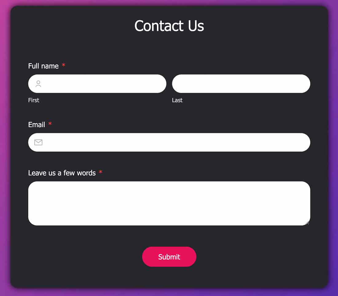
This is the sweet spot. It is enough to capture essential data (like name, email, and message) without feeling invasive or time-consuming.
If users can breeze through your form in under 30 seconds, you are doing it right.
2. Group related fields logically
When fields are scattered all over the place, users feel confused before they even start typing. A logical, clean layout reduces cognitive load and makes it easier for users to move through the form smoothly.
Keep related fields together
Think like a user. Naturally, people expect to see related fields like “Name” and “Email” placed together.
Prioritize flow and clarity
Remember that just because you can fit everything on one screen doesn't mean you should.
3. Use clear and conversational field labels
People respond better to language that feels natural and human. Labels should act like friendly guides.
Skip the jargon
Use clear, universally understood terms. For example, say “Email Address” instead of “Email ID”, or “Phone Number” instead of “Mobile Contact Info”.
Keep it conversational (when appropriate)
Swap stiff prompts like “Query Subject” with something more human, like “What can we help you with today?” It makes users feel more welcomed and understood.
Test your form labels by reading them out loud. If it doesn’t sound natural, it probably needs rewording.
4. Make the CTA button stand out
Your call-to-action (CTA) button is the the final nudge that turns a visitor into a lead, customer, or contact. If it fades into the background or feels uninspiring, you risk losing that conversion.
Use strong, clear action verbs
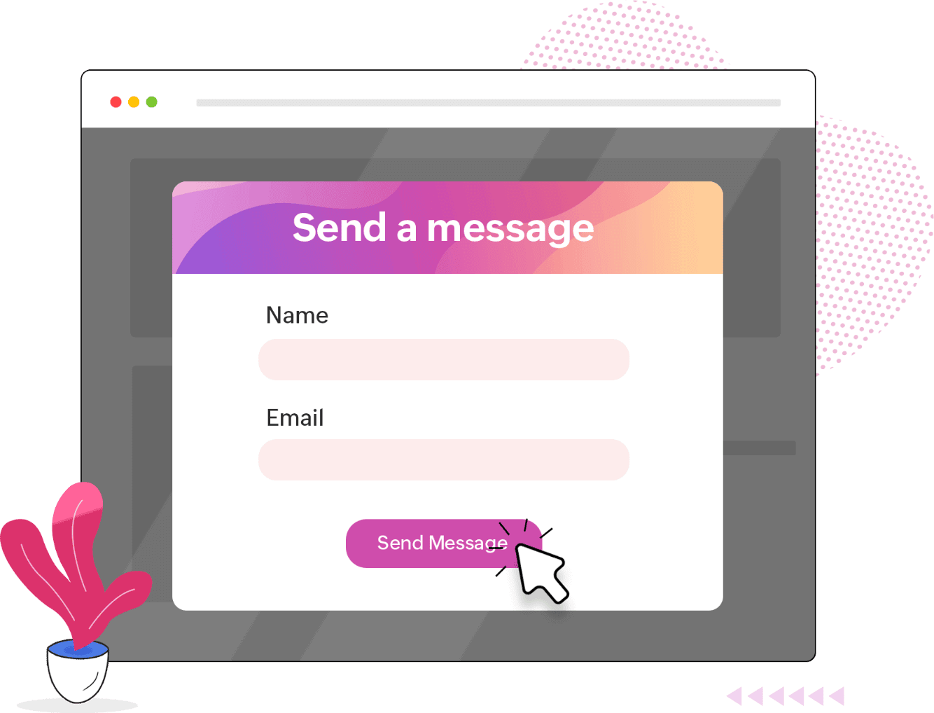
Your button should tell users exactly what’s going to happen. Avoid vague labels and identify a specific action like “Send Message”, “Get in Touch”, or “Start a Conversation” to make the form engaging and comfortable to use.
Make it visually pop
Use a contrasting color that stands out against the rest of your form but still fits within your brand palette. A standout button draws the eye and subtly signals where the user should go next.
One CTA per form is ideal. Too many buttons = too many decisions = no action at all.
5. Add a Thank You message (and Next Steps)
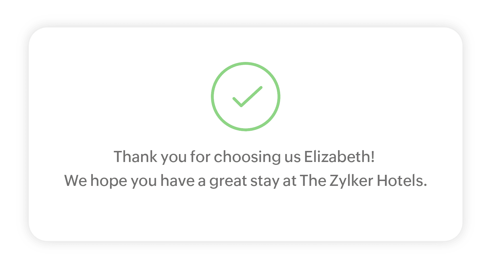
Submitting a form shouldn’t feel like sending a message into the void. A thoughtful thank you message reassures users that their effort wasn’t wasted and sets the tone for future interactions.
Say thank you genuinely
A simple “Thank you for reaching out!” goes a long way. It closes the loop and makes users feel acknowledged.
Set expectations clearly
Let users know what to expect. For example: “We have received your message and will get back to you within 24 hours.” This helps manage their anticipation and builds trust.
Offer helpful next steps
Keep the momentum going. Suggest relevant content, link to your blog, or offer product resources. For instance: “While you wait, check out our website.” It’s a subtle way to keep users engaged.
You can also send a confirmation email summarizing the submission, especially for support or inquiry forms. It adds an extra layer of professionalism and reliability.
6. Respect privacy & be transparent
Users are understandably cautious about sharing personal information. If your form does not feel trustworthy, they won't fill it out.
Be upfront about data usage
Let users know why you are asking for their information and how you will use it. A simple note like “We will only use your email to respond to your inquiry” can make a big difference.
Link to your privacy policy
Include a clearly visible link to your privacy policy. It shows you're serious about protecting their data and gives users a sense of control.
Avoid requesting unnecessary sensitive data
Unless you absolutely need it, steer clear of asking for things like birth dates, home addresses, or ID numbers.
How Zoho Forms helps create better contact forms
Ready to put these best practices into action? Zoho Forms is your go-to form builder that makes it easy to build beautiful, user-friendly contact forms that convert. With intuitive drag-and-drop tools, conditional logic, customizable themes, and built-in integrations, you can create secure contact forms that not only look great but also work hard for your business.
Explore our contact form builder.
Drag-and-drop builder for easy customization
Build your forms exactly the way you want, without any technical expertise with an online form creator like Zoho Forms. It's intuitive drag-and-drop interface lets you add and arrange fields effortlessly, saving you time and making the process fun and flexible.

Conditional logic for smart, dynamic forms
Create smarter custom forms that adapt to user input in real time. With conditional logic, you can show or hide fields, send form responses to specific team members, or trigger workflows based on the user’s answers, making your form experience contextual and clutter-free.
Customizable themes for a branded experience
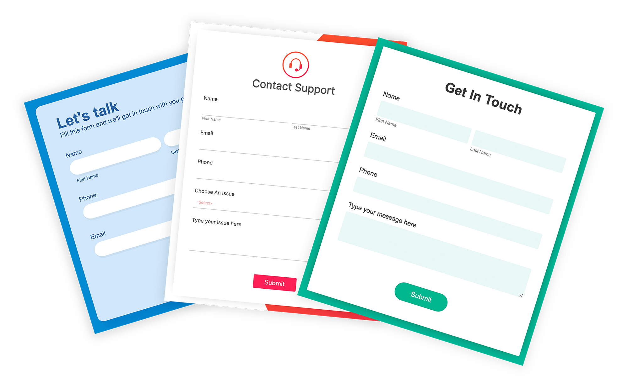
Make your form feel like a natural extension of your website or product. Choose from prebuilt templates or apply your own branding with custom colors, fonts, and logos. A consistent visual identity helps build trust and reinforces professionalism. Explore free form templates in Zoho Forms.
Powerful integrations for seamless workflows
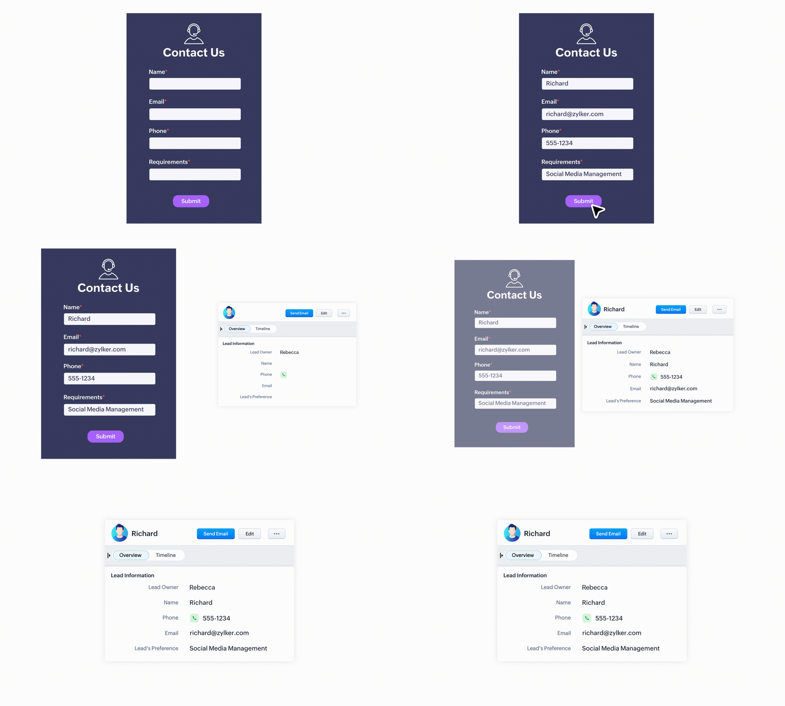
Zoho Forms integrates smoothly with a wide range of apps: CRM, email marketing tools, spreadsheets, cloud storage, and more. Automatically push form responses into Zoho CRM, trigger email campaigns in Zoho Campaigns, or sync data with Google Sheets.
Secure data collection with privacy controls
Protect user data with SSL encryption, CAPTCHA, GDPR-compliant features, and secure access controls. Zoho Forms also allows you to add consent checkboxes, link your privacy policy, and set up submission limits so your forms remain compliant.
Mobile-friendly & offline capable
Your users are not always on a desktop, and your form should not be either. Zoho Forms is fully responsive, ensuring a smooth experience on any device. Plus, with offline mode, you can collect responses even without internet access, perfect for field teams or remote environments.
Automated emails and follow-ups
Keep your communication loop intact. Set up autoresponders to thank users instantly after submission, send confirmation emails, or notify your team in real time. You can even schedule follow-up emails based on form responses.
Whether you are a marketer, support rep, or business owner, Zoho Forms helps you with contact form examples and templates to streamline communication, capture leads efficiently, and keep the conversation going.
Your contact form is your first impression
A well-designed contact form is a doorway to meaningful interaction. By making your form short, smart, and welcoming, you encourage users to take that first step toward connection. And with a form builder like Zoho Forms, crafting that perfect form becomes a whole lot easier.